[Continuing Art Discussion Month 2010. 31 days, 31 artists, a whole lot of discussion. The explanation behind my choice of comics and the archive can be found here.]
Tokyo Storm Warning #1-3. Written by Warren Ellis. Pencilled by James Raiz. Inked by Andrew Currie and Trevor Scott. Additional art on issue 3 by Carlos D'Anda. Coloured by Wildstorm FX.
This is a cute book. Basically, it's all of the superficial elements of Japanese monster/robot entertainment crammed into one larger explanation, beginning with the idea that Tokyo had an atomic bomb dropped on it in 1945 based on intel suggesting Japanese had their own atomic weapons program. Now, an America, Zoe Flynn, has been sent to Tokyo in an exchange program to fly one of their ARCangels, giant robots piloted by humans. They appeared one day in 1992 after the previous round of giant robots stopped working. They fight the monsters that appear out of thin air and always head toward the Tokyo Storm Tower, destroying whatever is in their path. Turns out, they're trying to get the power source, which is an interesting little idea that I won't spoil.
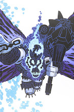
I don't mind the art or this series as much as others seem to, but I don't really like it either. Raiz can draw nice looking robots and monsters, but his people are overly detailed in all the wrong ways, looking somewhat twisted and unnatural. His giant robots and monsters fighting is tough to follow. Really, his storytelling isn't strong. That comes from his intricate art that has no sense of texture or depth. Everything is evened out and flat, so, when we have an ARCangel fighting a monster, the panels are just jumbled messes of lines and detail without any sense of what's actually happening. I can guess at what I'm supposed to be seeing, but I can't say for sure.
One big problem there is that he's drawing big, giant things, but chooses to show them in close-ups, focusing in on specific parts and that leaves us contextless, especially when you do that for four straight pages. There's no sense of the size of them.
He overdraws pages, providing so much detail that it all becomes meaningless, in a sense. You can't really focus on anything. Nothing draws your eye or attention. That's what I mean by flat: it's all equal, everything you see. Soon, your eyes just gloss over and you don't really see anything on the page. And this is a giant robot fighting a fucking three-headed lizard monster! If you're boring me and making me skim, you're just drawing it wrong, plain and simple.
Carlos D'Anda does a few pages in the third issue and that leads to an unintentionally funny moment. In that issue, three monsters appear and they're meant to be Godzilla, Rodan, and Gamera. Raiz's Godzilla and D'Anda's Godzilla are kind of similar, but it's like going from the Japanese version to the American one as far as the look goes -- the colouring even noticeably changes.
The colouring doesn't help the art. It's equally flat, not trying to emphasise what the reader should be looking at. In panel, it adds a blur effect to a monster's movement that's never repeated for movement again anywhere in the series.
Honestly, it's a cute little book that I'm kind of annoyed is attached in a flipbook with Red since that series is one of my favourites and this is just kind of there. (I wonder how they decided which of the three-issue minis to stick together, because Reload and Red seem like the obvious choices for a flipbook given the similar subject matter...)
And, tomorrow, we'll look at Cully Hamner's work on Red.
X-Men: Forever #2 annotations
6 hours ago